
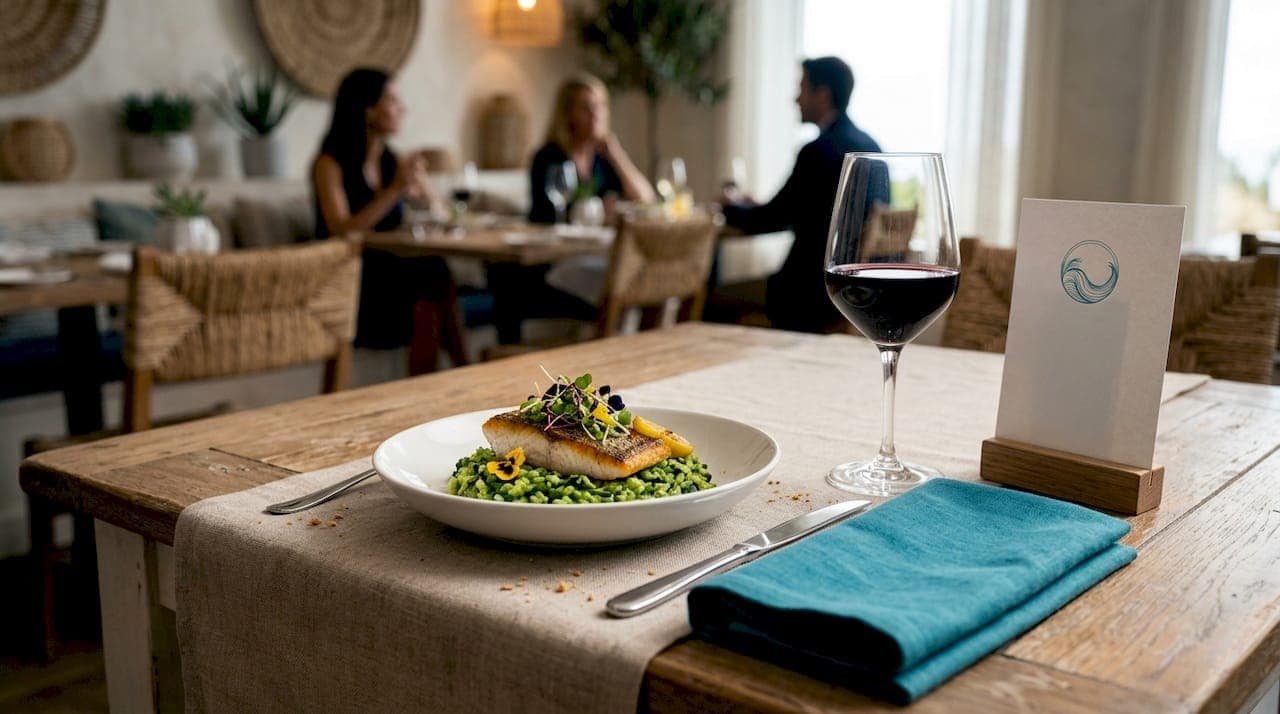
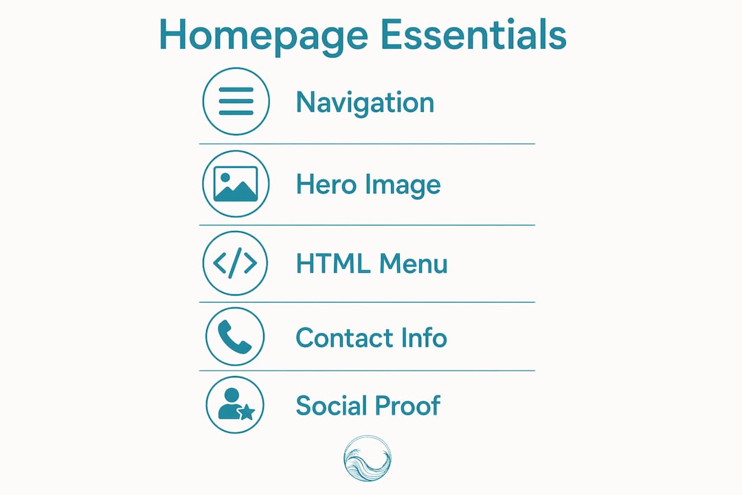
Restaurant website homepage essentials are the specific design, content, and technical elements that determine whether a visitor books a table, places an order, or leaves within seconds. Your homepage is not a digital brochure. It is your highest-traffic conversion tool, and most restaurants underestimate how much revenue it controls. Platforms like OpenTable and Google My Business drive diners to your site, but what happens after the click is entirely up to your homepage. Over 60% of restaurant website traffic arrives on mobile devices, which means a slow, cluttered, or confusing homepage costs you real reservations every single day.
What are the essential elements of a restaurant homepage?
The professional term for this discipline is conversion-focused web design, and for restaurants, it centers on removing every barrier between a hungry visitor and a confirmed booking. The core components are not optional extras. They are the foundation of any effective restaurant landing page.
Navigation that does not overwhelm
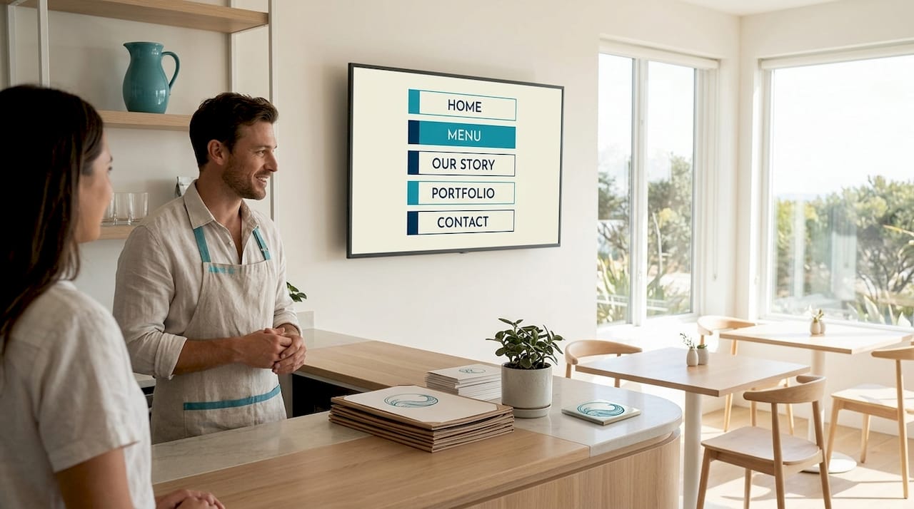
Limit your navigation to 5 items or fewer to reduce visitor friction and keep attention focused on booking or ordering. The standard set that works for most restaurants is: Menu, Book or Order, About, Location/Contact, and Gallery. Everything else belongs in the footer. A logo on the left, navigation links in the center or right, and a high-contrast "Book Now" button in the header is the layout that converts consistently.
A hero section that sells the experience
Your hero image or short video clip is the first thing a visitor sees. It should show your actual food, your actual dining room, or your actual team. Stock photography signals inauthenticity immediately, and authentic visuals build more trust than any generic image of a fork on a white tablecloth. Pair the hero with a single headline that states what you are and where you are, plus a prominent CTA button above the fold.
A text-based menu, not a PDF
This is the single most common mistake restaurant owners make. HTML menus allow Google to crawl and index individual dishes, prices, and ingredients, which improves your search visibility directly. PDF menus block both search engines and AI tools from reading your content, which reduces your discoverability across every platform. A native web page menu also loads faster and reads cleanly on any screen size.
Contact information and hours, visible without scrolling
Your address, phone number, and opening hours should appear in the header or immediately below the hero section. Do not make visitors hunt for this information. A click-to-call phone number is mandatory on mobile.
Social proof integrated into the page
Customer reviews from Google, Yelp, and TripAdvisor build trust before a visitor has ever tasted your food. Embed a live review feed or display three to five curated testimonials near the bottom of your homepage. This placement captures visitors who scrolled past your CTA and need one more reason to commit.
Pro Tip: Place your primary "Book Now" or "Order Online" button in at least two locations on the homepage: once in the header and once after the hero section. Visitors who scroll past the fold are still convertible.
How to optimize your restaurant homepage for mobile and performance in 2026
Mobile performance is not a design preference. It is a Google ranking factor, and it directly affects how many visitors complete a reservation or order. The technical standard to meet is Google's Core Web Vitals framework.
The three metrics that matter
Core Web Vitals thresholds for good user experience are: Largest Contentful Paint (LCP) under 2.5 seconds, Interaction to Next Paint (INP) under 200 milliseconds, and Cumulative Layout Shift (CLS) under 0.1. Google measures these at the 75th percentile of real user sessions. Miss these thresholds and your site ranks below competitors who meet them, regardless of how good your content is.
| Metric | Target | What it measures |
|---|---|---|
| LCP | Under 2.5s | How fast your main image or text loads |
| INP | Under 200ms | How quickly the page responds to taps or clicks |
| CLS | Under 0.1 | How much page elements shift during loading |
Four practical steps to hit those targets
- Compress every image before uploading. Use WebP format instead of JPEG or PNG. A hero image should not exceed 200KB.
- Specify image dimensions in your HTML so the browser reserves space before the image loads, which eliminates layout shift and improves CLS.
- Defer non-critical JavaScript. Third-party scripts for chat widgets, analytics, and social feeds are common culprits for slow LCP scores.
- Remove auto-playing video with sound and avoid multiple rotating sliders. Most visitors leave before a slider's second image loads, so a single static hero image outperforms a carousel every time.
Test your homepage with Google PageSpeed Insights after every major update. It gives you a score for both mobile and desktop, flags specific issues, and tells you exactly what to fix. Sites that pass Core Web Vitals gain a measurable SEO and conversion advantage over slower competitors. That advantage compounds over time.
Pro Tip: Test your booking button on a real iPhone and a real Android device, not just a browser simulator. Time how many seconds it takes to locate and tap the button. If it takes more than three seconds, your UX has a friction problem.
How to structure content and navigation to drive reservations
Layout is strategy. Where you place elements on your homepage determines how many visitors reach your booking or ordering flow. The following structure is the one that converts most reliably for restaurants.
A proven homepage layout template
- Header: Logo left, navigation center, "Book Now" button right in a contrasting color
- Hero section: Full-width image or short video, headline, and a second CTA button
- Quick info bar: Address, phone number, hours, and a map link in a single horizontal strip
- Menu highlights: Three to five featured dishes with photos and prices
- Social proof: Review snippets or star ratings from Google or TripAdvisor
- Secondary CTA: "View Full Menu" or "Order Online" button before the footer
- Footer: Full navigation, social links, legal pages, and newsletter signup
Common mistakes that kill conversions
- Burying the booking button below the fold or in a dropdown menu
- Using a PDF menu as the only menu option on the site
- Listing ten or more navigation items, which creates decision fatigue
- Using a phone number that is not click-to-call on mobile
- Failing to display hours prominently, which forces visitors to search elsewhere
A quick homepage audit checklist
- Can a visitor find your phone number within five seconds on mobile?
- Is your "Book Now" or "Order Online" button visible without scrolling?
- Does your menu load as a web page, not a PDF or image file?
- Are your opening hours current and displayed above the fold or in the header?
- Does your homepage load in under three seconds on a 4G connection?
Navigation simplicity directly impacts user decisions and engagement, particularly on mobile where screen space is limited and patience is short. Every extra menu item you add is a small tax on your visitor's attention.
How to use branding, storytelling, and social proof to build trust
A homepage that converts is not just functional. It is believable. Visitors decide within seconds whether your restaurant feels like the right choice, and that decision is emotional before it is rational.
Tell a story that is specific, not generic
Your "About" section does not need to be a full page. A two-sentence origin story on the homepage, paired with a photo of the owner or the kitchen team, does more for trust than a paragraph of marketing language. Specificity is what makes a story credible. "Family-owned since 1987, serving traditional Corfiot recipes passed down three generations" is far more persuasive than "We are passionate about great food."
Use photography that shows reality
Professional food photography and authentic visuals influence diner choices more than any written description. Hire a food photographer for one half-day session and use those images across your homepage, social media, and Google Business Profile. Show the dining room at capacity, the bar during a busy evening, and the kitchen team at work. These images communicate atmosphere in a way that words cannot.
Integrate social proof without cluttering the page
Live review feeds from Google and Yelp add dynamic, credible content to your homepage without requiring manual updates. Display your aggregate star rating prominently near the top of the page. Encourage guests to share photos on Instagram and embed a curated feed in your homepage footer. User-generated content is the most trusted form of social proof because it comes from real customers, not the restaurant itself.
Key takeaways
A restaurant homepage converts visitors into diners when it combines fast load times, clear CTAs, and authentic content in a simple, mobile-first layout.
| Point | Details |
|---|---|
| Keep navigation minimal | Limit to 5 items or fewer to reduce friction and guide visitors toward booking. |
| Use HTML menus, not PDFs | Text-based menus are indexed by Google and load faster on mobile devices. |
| Meet Core Web Vitals targets | Aim for LCP under 2.5s, INP under 200ms, and CLS under 0.1 for ranking and conversions. |
| Place CTAs above the fold | Book Now buttons must be visible without scrolling on both desktop and mobile. |
| Lead with authentic visuals | Real photography of food, staff, and atmosphere builds trust faster than any written copy. |
What I've learned from watching restaurant homepages succeed and fail
I have reviewed dozens of restaurant websites over the years, and the pattern is consistent. The ones that perform best are almost always the simplest ones. Not the most beautiful. Not the most feature-rich. The simplest.
Owners often want to showcase everything: a full gallery, a blog, a newsletter, a loyalty program signup, and a catering inquiry form, all on the homepage. The result is a page that does nothing particularly well. The restaurants that book out weeks in advance typically have a homepage with five elements: a stunning hero image, a visible phone number, a "Book Now" button, a short menu preview, and a handful of five-star reviews. That is it.
The other mistake I see constantly is treating the homepage as a one-time project. Menus change seasonally. Hours change for holidays. A homepage with outdated information does not just frustrate visitors. It signals that the business is not paying attention. Set a calendar reminder to audit your homepage every 90 days. Check that hours, menu items, and contact details are current. Test the booking flow on your phone. This takes 20 minutes and prevents the kind of friction that sends customers to a competitor.
The most underrated practice is testing on real devices. Browser developer tools simulate mobile screens, but they do not replicate the actual tap experience, the real network speed, or the way fonts render on a physical screen. Hand your phone to someone who has never seen your website and watch them try to make a reservation. You will learn more in five minutes than from any analytics report.
— ErikoFN
How Corfuwebsites can build your restaurant homepage the right way
If you have read this far and realized your current homepage is missing several of these elements, you are not alone. Most restaurant websites were built quickly, without a conversion strategy, and have not been updated since.
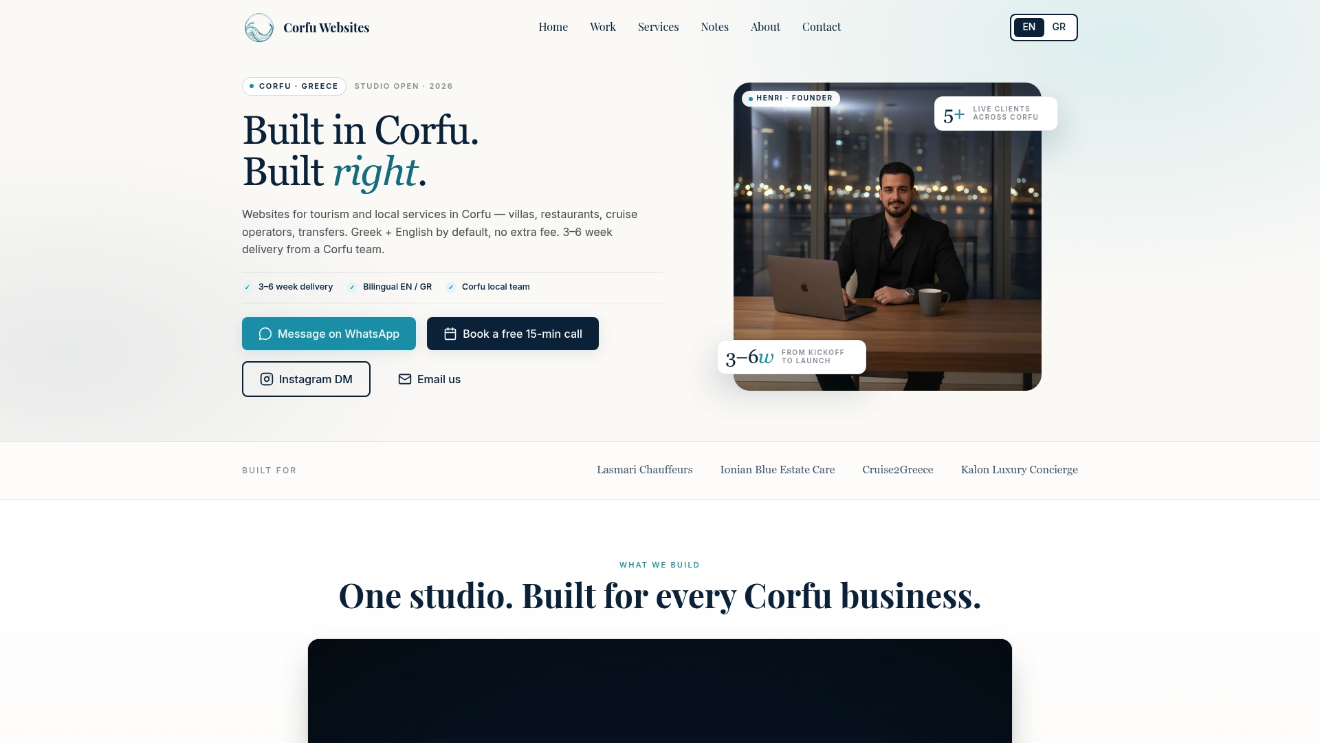
Corfuwebsites specializes in building high-performance restaurant and tourism websites in Corfu and beyond, using Next.js and Tailwind CSS to deliver sites that meet Core Web Vitals standards out of the box. Every site is mobile-first, bilingual in English and Greek where needed, and built with booking and ordering integrations from day one. Lasmari Chauffeurs saw a 3x increase in online reservations after their Corfuwebsites launch. Delivery takes 3 to 6 weeks. If you want a restaurant website that converts, explore the full range of web design services built specifically for hospitality businesses.
FAQ
What should every restaurant homepage include?
Every restaurant homepage needs a visible booking or ordering CTA above the fold, a text-based HTML menu, contact information and hours, high-quality authentic photography, and integrated customer reviews. These are the elements that directly drive reservations and reduce bounce rates.
Why should I avoid PDF menus on my restaurant website?
PDF menus cannot be crawled or indexed by Google or AI tools, which reduces your search visibility at the item level. They also load slowly on mobile and require a separate app to open, creating unnecessary friction for visitors.
How fast should my restaurant homepage load?
Your homepage should achieve an LCP of under 2.5 seconds, measured on mobile at the 75th percentile of real user sessions. Use Google PageSpeed Insights to test your current score and identify specific issues to fix.
How many navigation items should a restaurant website have?
Five or fewer. The standard set is Menu, Book or Order, About, Location/Contact, and Gallery. Additional pages like catering or events belong in the footer, not the main navigation.
Does social proof actually affect restaurant bookings?
Positive reviews from Google, Yelp, and TripAdvisor displayed on your homepage influence diner decisions before they ever visit. A live review feed adds credibility automatically and requires no manual content updates once set up.