

An optimized restaurant online menu is the single most powerful conversion tool on your website, directly determining whether a visitor places an order or leaves for a competitor. Restaurant online menu best practices center on one non-negotiable foundation: HTML menus embedded in mobile-first websites, not PDFs. From there, the decisions you make about category structure, food photography, pricing display, and backend configuration with tools like Toast POS all compound into measurable differences in average order value and repeat visits. This guide gives you the exact framework, grounded in consumer behavior data from DoorDash and accessibility standards from WCAG 2.1, to build a menu that works as hard as your kitchen does.
1. Why HTML menus outperform PDF menus every time
The format of your online menu is not a cosmetic decision. HTML menus load faster, adapt to any screen size without pinching or zooming, and allow you to embed ordering buttons, reservation links, and dietary filters directly in the page. A PDF forces the customer to download a file, zoom into small text, and then navigate away to place an order. That friction kills conversions.
HTML menus are also indexed by Google. Every dish name, ingredient, and category becomes searchable content that can drive organic traffic. A PDF is a black box to search engines. Beyond SEO, HTML gives you behavioral analytics: you can see which categories customers browse longest, which items they skip, and where they drop off before ordering.
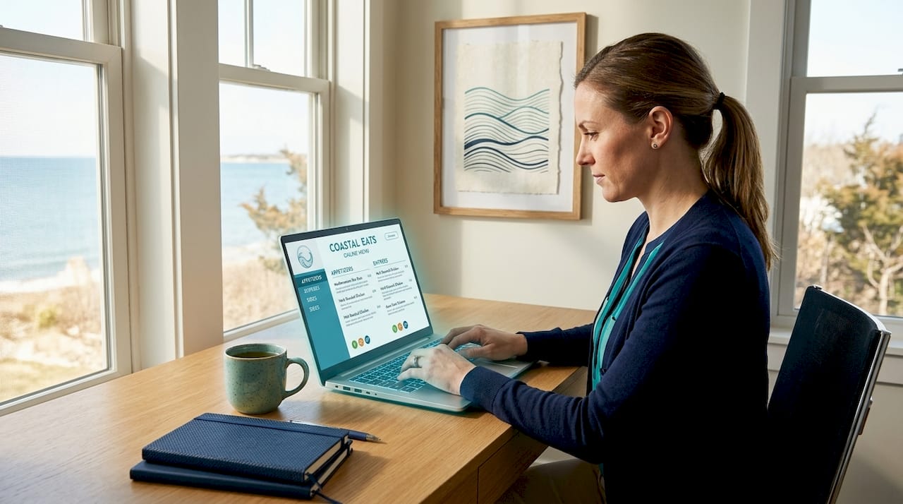
The most common mistake restaurants make when switching from PDF to HTML is recreating the PDF layout pixel for pixel. A digital menu is not a paper menu with a URL. It requires a completely different design logic built around thumb navigation, fast scanning, and integrated calls to action.
Pro Tip: If you currently use a PDF menu, keep it as a downloadable option for accessibility, but build a full HTML version as the primary experience. Never make the PDF the only option.
2. How to organize your online menu to increase order values
Menu structure is where most restaurants leave money on the table. Menus with 5 to 8 clear categories show 23% higher average order values than those with 12 or more categories. That number reflects a simple psychological truth: too many choices create paralysis, and paralyzed customers order less or leave.
Keep your category names grounded in how customers think, not how your kitchen is organized. "Small Plates" works better than "Appetizers and Starters." "House Favorites" outperforms "Chef's Specials" because it signals social proof. Avoid ambiguous labels like "Extras" or "Additions" that leave customers guessing what belongs there.
Here is a comparison of category structures that work versus those that hurt conversion:
| Approach | Effect on customer behavior |
|---|---|
| 5 to 8 focused categories | Reduces overwhelm, increases exploration across sections |
| 12 or more categories | Creates decision fatigue, lowers average order value |
| Customer-language category names | Builds instant recognition and trust |
| Kitchen-logic category names | Confuses browsing customers unfamiliar with back-of-house terms |
| Dietary markers on each item | Speeds up decision-making for dietary-restricted customers |
Place your signature and highest-margin dishes at the top of each category. Items above the fold get disproportionate attention because most mobile users scroll quickly and rarely return to the top. Sticky navigation headers and collapsible accordions on mobile prevent thumb fatigue on long menus.
Pro Tip: Add dietary icons (vegan, gluten-free, spicy) as small, scannable symbols next to item names rather than in the description text. Customers filter visually before they read.
3. Using visuals and descriptions to drive appetite appeal
Food photography on a digital menu is a double-edged tool. Done well, it increases order confidence and perceived value. Done poorly, it destroys trust faster than a bad review. Menu photography must be consistent and authentic, meaning the dish in the photo should match what arrives at the table. Misleading images reduce trust and conversions even when the food itself is excellent.
The practical rule is selective use over saturation. Feature photos on your top three to five signature dishes per category, not every item. A page crowded with images slows load time, overwhelms the eye, and actually reduces the appetite appeal of each individual dish. White space and clean typography make featured images pop harder.
Your item descriptions should do two jobs simultaneously: tell a story and reduce hesitation. "Slow-roasted lamb shoulder with lemon-herb oil and hand-cut fries" is more persuasive than "Lamb with fries" because it signals care, technique, and flavor. Keep descriptions to two to three lines maximum. Anything longer gets skipped on mobile.
On pricing, transparency beats cleverness. Display prices clearly and include any upcharge for customizations before the customer reaches checkout. Surprise fees at cart review are one of the top causes of order abandonment. If you offer add-ons, surface them early in the item detail view, not buried at the bottom of a customization modal.
4. Accessibility and technical setup that protect your business
Accessibility is not optional. WCAG 2.1 requires menus to support text resizing up to 200% without loss of functionality, with minimum contrast ratios and full keyboard navigation. Restaurants that ignore these standards face ADA compliance risk in the United States, and they also lock out a significant portion of potential customers who use assistive technology.
PDF menus lack the accessible markup needed for screen readers to interpret them correctly. An HTML menu built with semantic markup, proper heading hierarchy, and alt text on all images is the baseline for compliance. Verify compliance after every menu update, not just at launch.
On the backend, correct configuration inside your POS system is just as critical as the front-end design. Here is the setup sequence that prevents operational errors:
- Assign every menu item to the correct sales category so revenue reporting is accurate.
- Set tax rates at the item or category level, not as a blanket override.
- Route each item to the correct prep station in your kitchen display system. Unassigned items route to all stations by default, creating chaos during service.
- Configure open items with the same sales category and tax settings as standard items.
- Test the full ordering flow from customer-facing menu to kitchen ticket before going live.
Pro Tip: QR codes linking to your menu should point to a mobile-optimized HTML page, never a PDF. Place them at eye level on table tents or receipt headers, and test them on three different devices before printing.
5. Integrating your menu with ordering workflows
41% of US consumers prefer ordering directly from restaurant websites or apps rather than third-party platforms like DoorDash or Uber Eats. That preference represents a direct revenue opportunity because you keep the full margin instead of paying a commission of 15 to 30 percent per order. The catch is that your on-site ordering experience must be at least as smooth as the third-party alternatives.
The design decisions that make on-site ordering work are specific and measurable:
- Ask for delivery or pickup preference at the start of the ordering flow, not at checkout. This lets you show accurate pricing, availability, and estimated times from the first item selection.
- Keep the customer on your website throughout the entire ordering process. Any redirect to an external ordering page breaks trust and increases abandonment.
- Upsell prompts integrated inline within customization modals outperform full-screen pop-ups. Behavioral data shows intrusive modals increase cart abandonment, while subtle inline suggestions increase average order value.
- Design all interactive elements for thumb reachability. Primary buttons belong in the lower two-thirds of the screen on mobile. Filters and navigation belong at the top with sticky positioning.
- Add social sharing on order confirmation pages. A simple "Share your order" prompt with a pre-filled message costs nothing to implement and generates organic word-of-mouth.
Real-time menu updates through a centralized CMS or POS integration prevent the most common operational failure: a customer orders an item that is sold out or priced incorrectly. Static menus updated manually create gaps between what is shown online and what is available in the kitchen. Centralized updates eliminate that gap across every digital touchpoint simultaneously.
6. Keeping your menu fresh and data-driven
A menu published and forgotten is a menu that slowly loses revenue. The most effective online menu strategies treat the menu as a living document reviewed on a regular cycle, not a static asset. Most restaurant operators review their physical menu seasonally. Your digital menu should be reviewed monthly, because you have data that your printed menu never gave you.
Track which categories receive the most time on page, which items are added to cart and then removed, and where customers exit the ordering flow. Google Analytics 4 combined with heatmap tools like Hotjar gives you this picture without custom development. The patterns you find will surprise you. Items you assume are popular may have high views but low add-to-cart rates, signaling a description or pricing problem rather than a demand problem.
Seasonal updates also serve an SEO function. Fresh content signals to Google that your site is actively maintained. A menu page that has not changed in eight months ranks lower than one updated with seasonal specials, new items, and revised descriptions. Treat each seasonal update as a content marketing opportunity, not just an operational task.
Key takeaways
A restaurant's online menu performs best when HTML format, organized categories, authentic visuals, accessibility compliance, and integrated ordering all work together as one system.
| Point | Details |
|---|---|
| HTML over PDF | HTML menus load faster, rank in search, and support direct ordering without downloads. |
| 5 to 8 categories | Fewer, clearer categories produce higher average order values and less decision fatigue. |
| Selective photography | Feature photos on signature dishes only; consistency between image and dish builds trust. |
| WCAG accessibility | Build accessible HTML menus from the start; verify compliance after every update. |
| Backend configuration | Correct POS routing and tax setup prevents kitchen errors and ordering failures. |
What I've learned from watching restaurants get their menus wrong
Most restaurant owners treat their online menu as a digital version of their printed one. That assumption costs them real money. I have seen beautifully designed restaurants with menus that are essentially scanned PDFs uploaded to a website, and they wonder why their online orders are a fraction of their walk-in volume.
The insight that changed how I think about this: the menu is not a document. It is a sales funnel. Every category, every item placement, every photo decision either moves a customer toward an order or gives them a reason to hesitate. When you frame it that way, the decisions become clearer. You stop asking "does this look good?" and start asking "does this reduce friction?"
The backend piece is the part most design-focused conversations ignore entirely. I have watched restaurants launch gorgeous mobile menus only to have their kitchen in chaos because nobody configured the prep station routing in their Toast POS setup. The front end and the back end are one system. A failure in either one undermines the other completely.
My honest recommendation: audit your current menu against three questions. Does it load in under three seconds on a mobile device? Can a customer with a visual impairment use it with a screen reader? Does placing an order keep the customer entirely on your website? If any answer is no, that is where you start. Design trends come and go. Those three fundamentals do not.
— ErikoFN
How Corfuwebsites builds menus that actually convert
Corfuwebsites designs mobile-first restaurant websites built on Next.js and Tailwind CSS, with online menus that are fast, accessible, and integrated with ordering and booking systems from day one. Their team understands the specific needs of restaurant operators, from correct POS configuration to bilingual menu content for international guests. Clients like Lasmari Chauffeurs saw a 3x increase in online reservations after launch, and the same approach applies directly to restaurant ordering flows. If your current menu is a PDF or a slow-loading page that sends customers to a third-party platform, it is time to fix that. Explore their restaurant web design services or see past restaurant projects to understand what a properly built digital menu looks like in practice.
FAQ
What format works best for a restaurant online menu?
HTML menus embedded directly on your website outperform PDFs in mobile usability, SEO indexing, and conversion. PDFs require downloads, do not resize correctly on mobile, and cannot support integrated ordering buttons.
How many menu categories should a restaurant have online?
Five to eight categories produce the highest average order values. Menus with 12 or more categories create decision fatigue and reduce how much customers explore across sections.
Do restaurant menus need to be ADA accessible?
Yes. WCAG 2.1 standards require text resizing up to 200%, minimum color contrast ratios, and keyboard navigation support. PDF menus typically fail these requirements and expose restaurants to ADA compliance risk in the United States.
How do I prevent my online menu from showing sold-out items?
Connect your menu to a centralized CMS or POS system like Toast that pushes real-time updates across all digital touchpoints. Manual updates to static menus create gaps between what is shown online and what is available in the kitchen.
Should I use food photos on every menu item?
No. Selective photography on your top three to five signature dishes per category is more effective than images on every item. Overloading a page with photos slows load time and reduces the visual impact of your best dishes.